This week we continue our “Sneak Peak” series of posts that take a deeper look into one of our projects. Most architects websites, ours included, feature a portfolio section which acts as a digital analogue to our leather bound physical portfolio. This provides a superficial look at our past work with a series of pretty pictures. The intent of our “Sneak Peak” series is to provide deeper insight and context into the design challenges and solutions behind these pretty pictures. This post will focus on our “Healthy House” project in Riverside, Ct which was completed in 2006.
Our clients, a young family of four, approached our office to design a new house in Riverside at a yet to be determined site. Once they had narrowed their search to a couple of properties, we visited each property (as we frequently do with our clients) and explored the pros/cons of each site - we did FAR computations, setback and utility reviews, solar orientation, etc. After our review, our clients purchased a .472 acre property, which allowed them a home of no more than 4,537 square feet. The property is on a wonderful dead-end street in Riverside with a south facing lot and a wonderful streetscape.
One of the primary concerns of our clients was the indoor air quality of the home. The family had multiple chemical sensitivities that the homes with standard construction materials and practices had exacerbated. As such, we had to review and evaluate every material that we specified for the home and every typical construction practice with respect to their effect on the indoor air quality of the home. Therefore, the primary goal of the project was to design a house focused on indoor air quality, while simultaneously designing a beautiful, high-end home with graceful proportions and quality finishes.
After a pre-design review of our clients needs and goals as well as a review of case study images, we decided to proceed with a classic shingle style home in a more formal design vocabulary. Because of the small lot and the streetscape context, this shingle style home would be more “elevationally” designed than other shingle style homes we have designed. In many shingle style homes on larger properties, we would typically design an asymmetrical structure that offered different views and unexpected moments as you moved around it - the result being a home with a sculptural quality. In this house, we designed the front elevation to respond to the streetscape with a more symmetrical design and a more formal trim package. On the exterior of the house we detailed the roof and walls in such a way that all of the shingles are back-vented with a drainage layer so that the wall surfaces can dry as quickly as possible to prevent mold growth and moisture issues.
With any house it is really important to break down the scale of the home into beautifully proportioned, and well composed elements. In this home, the first floor roof lines at the front door and wrap around porch cast deep shadows on the southern facing (direct sun) elevation. Also, the second floor overhangs at the two front gables as shown in this image separate the first floor from the second floor gables which result in pleasing proportions and shadows at the first floor. Finally, the balance between white trim, columns and beams, and this panelized bay (the “white” elements) and the Western Red Cedar shingles help break down the scale of the two story home into a beautifully composed front elevation.
The Porte Cochere serves as a place to park the car to unload kids, dogs and groceries. It also allows for a detached garage in the rear yard which reduces the visible mass of the front elevation, and de-emphasizes views of garage doors from the street. The paving at the porte cohere changes from blacktop to bluestone to break up the driveway and emphasize the side entrance into the mudroom. The driveway edge is a vertically installed bluestone instead of the typical belgium block.
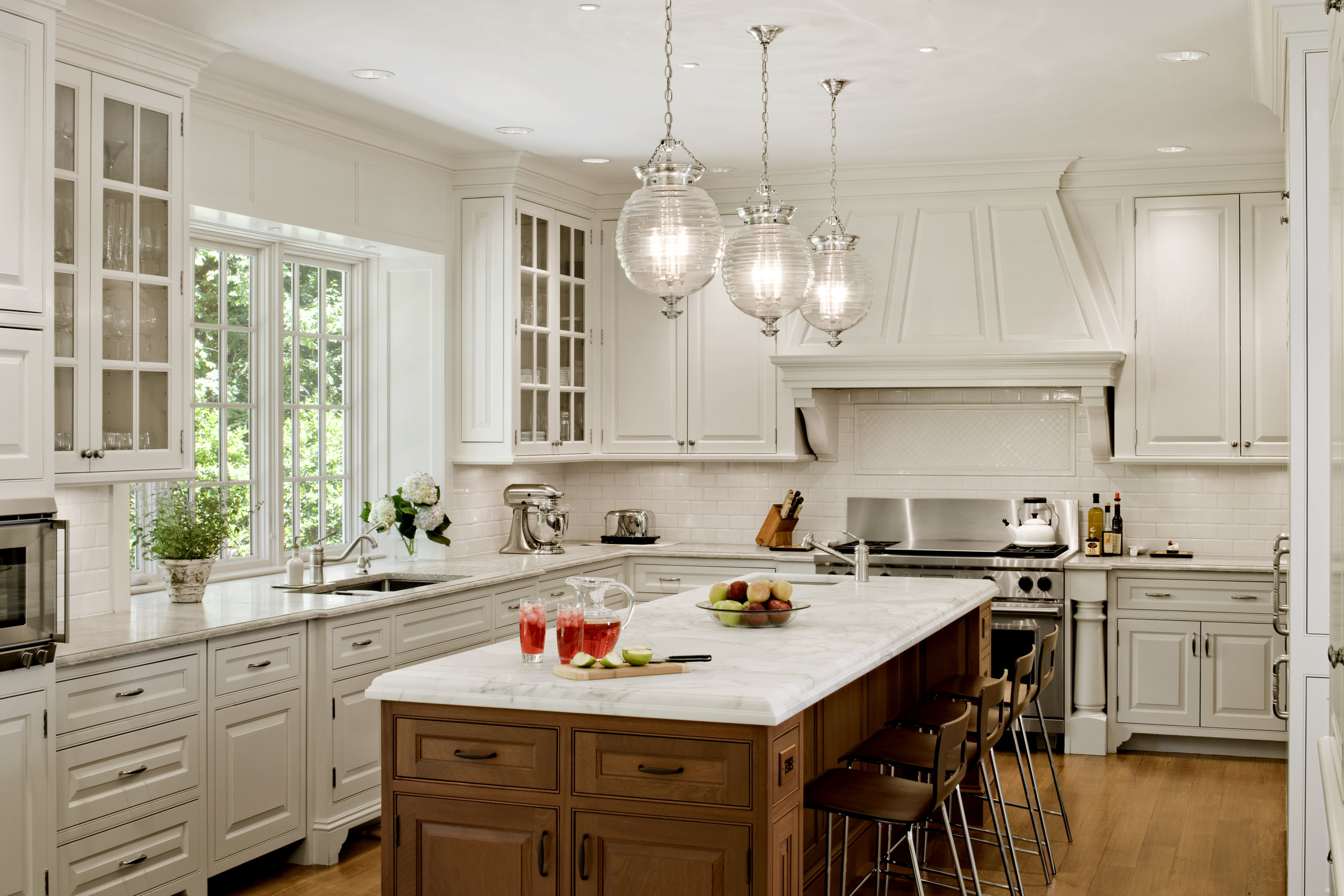
The kitchen is composed of custom cabinetry with painted perimeter cabinets and a stain-grade mahogany island. The perimeter countertops are a gray-green limestone with a custom edge profile. We decided on a handmade ceramic backsplash tile which becomes a subtle backdrop to the other elements of the kitchen. It’s hard to see in this image, but to the right of he sink, we cut grooves into the limestone counter to serve as a custom drain board. The island is a beautifully clean Calacatta Gold Marble with a thickened edge profile which makes the island counter a chunky 2 1/2” thick. At the kitchen sink, we designed a bay window which gives ample space behind the sink and we brought the windows down to the countertop. At the gas range, we designed custom turned posts which gave us the opportunity to use a professional range which would have otherwise stuck out 2 inches from the face of the cabinetry. In terms of the “healthy” aspects of the kitchen, we specified cabinet boxes to be made from a particular brand of plywood that uses glues that do not contain arsenic (most do) and finishes and adhesives that were approved for their voc qualities and chemical make-up. The HVAC system incorporated a make-up air system so that when the hood is operating, outside air is drawn into the heavily filtered HVAC system and replaces the air lost to the hood venting. This prevents problems with pressures in the house which can draw in pollinated, unfiltered air through small cracks around windows and doors.
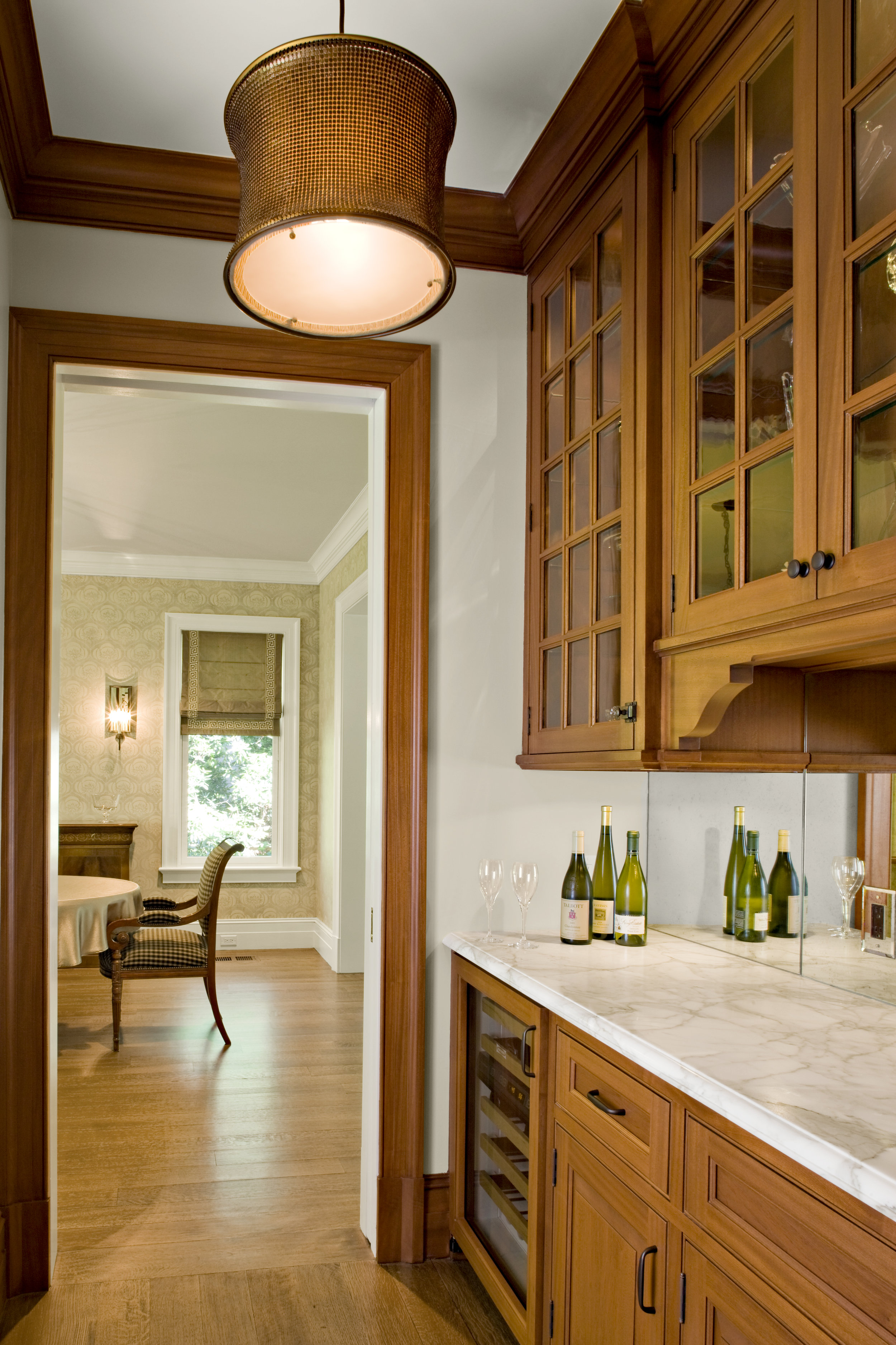
This is the Butler’s Pantry between the Kitchen and Dining Room. We designed custom mahogany cabinetry and a Calacatta gold counter to match the island in the kitchen. The backsplash is a lightly antiqued mirror. In the Dining Room the walls were stenciled by a specialty paint company. The stencil was sized for the height of the room, so that the baseboard and crown moulding assembly would not cut off the pattern. This process was a 6 step process to produce the background in a linen finish, and a mix of plaster and paint for the stencil.
The wood flooring is a beautiful rift & quarter sawn white oak in long boards. In standard construction, wood floors are nailed to formaldehyde emitting underlayment and then finished with solvent-based finishes that will off-gas for months. In this project, old-fashioned, solid 1x8's were installed diagonally over the framing for the subfloor (instead of plywood), "dustless" sanding with a HEPA vacuum was specified to the floor installer and a solvent-free floor finish was used.
This is the second floor landing of our entrance stair. The handrail, and balusters are all custom profiles with alternating painted baluster profiles and a stained mahogany handrail. The arch top windows have custom muntins and serve to bring light down the open stair area into the entry space. The walls throughout the house are a specific sheetrock product that uses glass fibers on the surface instead of the typical paper face - the paper surface on gypsum board is a nutrient that promotes mold growth. Because the glass-fiber surface of the specified sheetrock was not as smooth as we like, we had the entire house skim-coated with a thin layer of a special joint compound that was evaluated based on it’s chemical make-up. In addition to foamed sill & top plates of the wall framing, the sheetrock was tightly sealed/taped and was thoroughly sealed around all openings (windows/doors, plumbing penetrations, electrical outlets, recessed lights, etc). This airtight assembly prevents airborne moisture and undesireable gasses from penetrating the building envelope. Finally, all the paints, glues, sealants and other elements that make up the house had to be specified based on their chemical make-up because gypsum board sucks up the chemicals of the home during construction and then releases them into the space over the next decade.
This is an image of the same windows at the second floor landing, but from the exterior. Here we designed shingle pilasters to give the custom mahogany brackets a base to sit on. The white trim here was simplified down to a flush panel, so that fussy trim details would not take away from the custom windows. Because the typical (pink) fiberglass insulation can release particulate matter and formaldehyde gasses, and must carry a warning label "probably human carcinogen", we researched alternatives to the typical insulation package. The insulation package throughout the house consisted of a spray foam insulation that encompassed the shell of the building (roof, exterior walls & floors at the overhangs). The spray foam insulation that we used is free of formaldehyde, CFC's and HCFC's. On the interior we used a formaldehyde-free, natural fiber insulation made mostly of recycled cotton/denim. The result is a very tight, well insulated and sound controlled home.
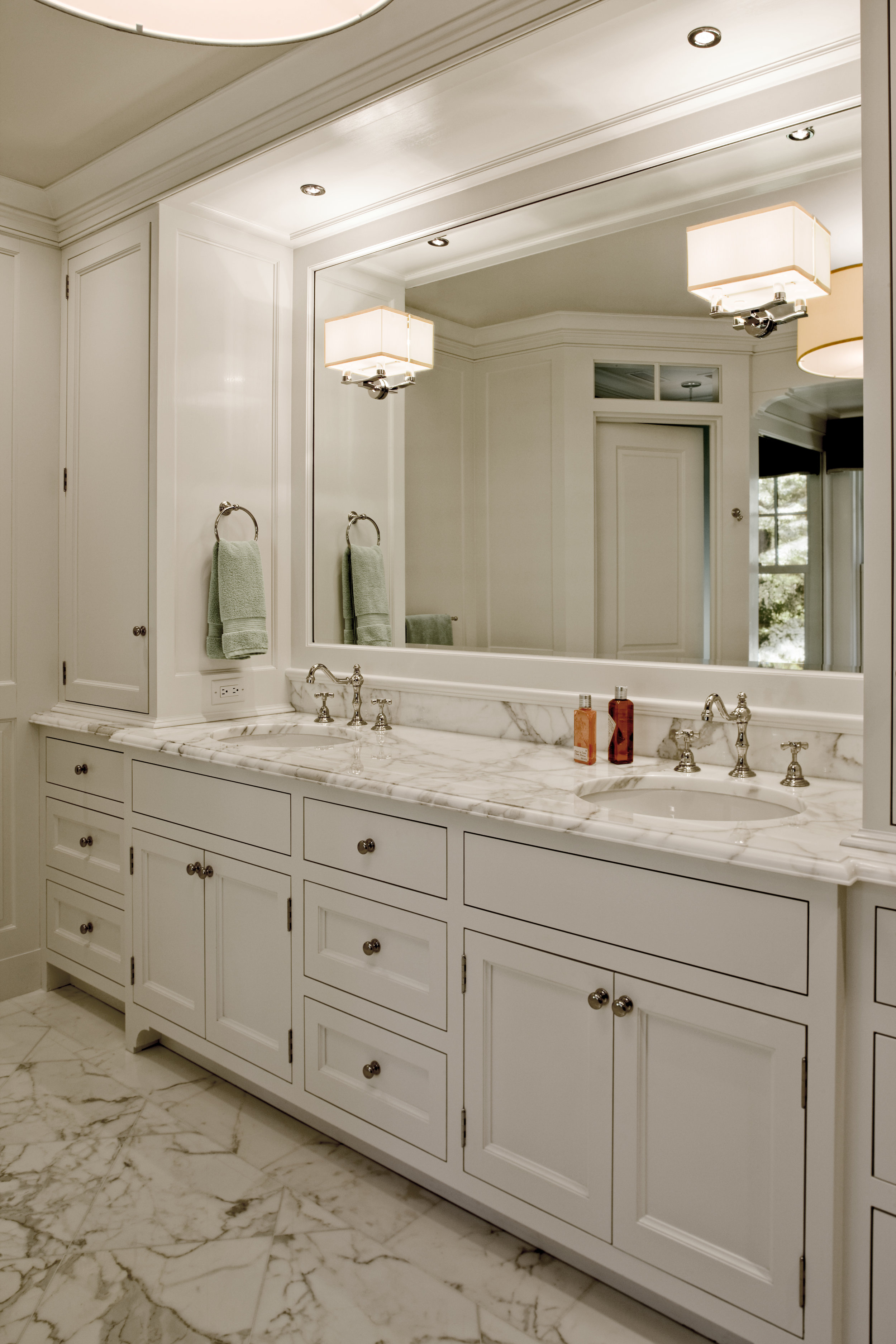
This is the master bathroom view toward the vanity - a custom 13 foot long vanity with flanking upper cabinets that serve as medicine cabinets as well as storage. At the bottom of these upper cabinets we incorporated a pull-out shelf with an electrical outlet for the hair dryer. The tile floor as well as the countertop were Calacatta gold tile. Because the tile had such a strong veining pattern, the tile was opened from it’s boxes and laid-out on the Master Bedroom floor in a pleasing a combination as possible, then numbered for installation. The tile grout we specified was a product that did not contain fungicides or latex additives as typical grout products do. The sealer we specified does not contain the harmful chemicals or high-levels of VOC's as is typically used. As we frequently do, we installed the wall sconce through the fixed mirror. This means that the specific light fixture needs to be selected not only based on its front view, but also from the back because the rear of the shade is reflected into the mirror. And, as with all wall sconces, we do not determine the height based on drawings, but leave the wires long so that we can hold up the sconce and locate the height in the field. We do this because even an inch up or down really affects how the composition feels in the space.
This shows the other side of the Master Bathroom with the tub, shower and toilet room. The tall windows bring ample light into the space, but can be screened for privacy via a mechanical shade that is custom built into the ceiling panel above the tub.
Although, it doesn’t have much to do with this image, we would be remiss if we didn’t mention the sophisticated HVAC system in this house. Because of the client’s multiple chemical sensitivities, we collaborated with a MEP Engineer to design the heating and air conditioning system. The system was designed with two “pre-filters” that filter the air before it is conditioned, a pleated “post-filter” and several heap-filters that provide an extremely clean supply air. The heating and cooling coils also incorporate a UV light to prevent mold growth. The system is designed to continuously run so that the air is continually run back through the filtration system. Finally, several ERV’s are incorporated into the system which brings in fresh air (via the filtration system) so that the air in the house is changed with fresh, filtered air 7 times a day.
A project such as this requires a very dedicated design team (both Architect and Owner). We did extensive research into several books and research reports on indoor air quality and healthy construction practices. The homeowner was dedicated to this process and put in countless hours of their own research and following up on reviewing the chemical makeup of various products. We had a mold specialist, MEP engineers as well as Building Science Corp review our drawings and make their recommendations. Finally, we had a builder that went through the painstaking process that involved atypical materials and construction processes that were not typical for the industry. The result is a healthy home that is focused on indoor air quality, that is beautiful as well.
Check out other Sneak Peak posts in the Series:


